Customizing Chatbot Appearance
info
This document will help you customize your chatbot to align with your brand identity by matching colors, fonts, adding logos, and modifying style parameters of chatbot views that can be embedded on your website.
In Thinkstack, we offer four different views to display your chatbot on your website. Each option can be fully customized in terms of style, including colors, fonts, and font-size. Let’s explore these options.
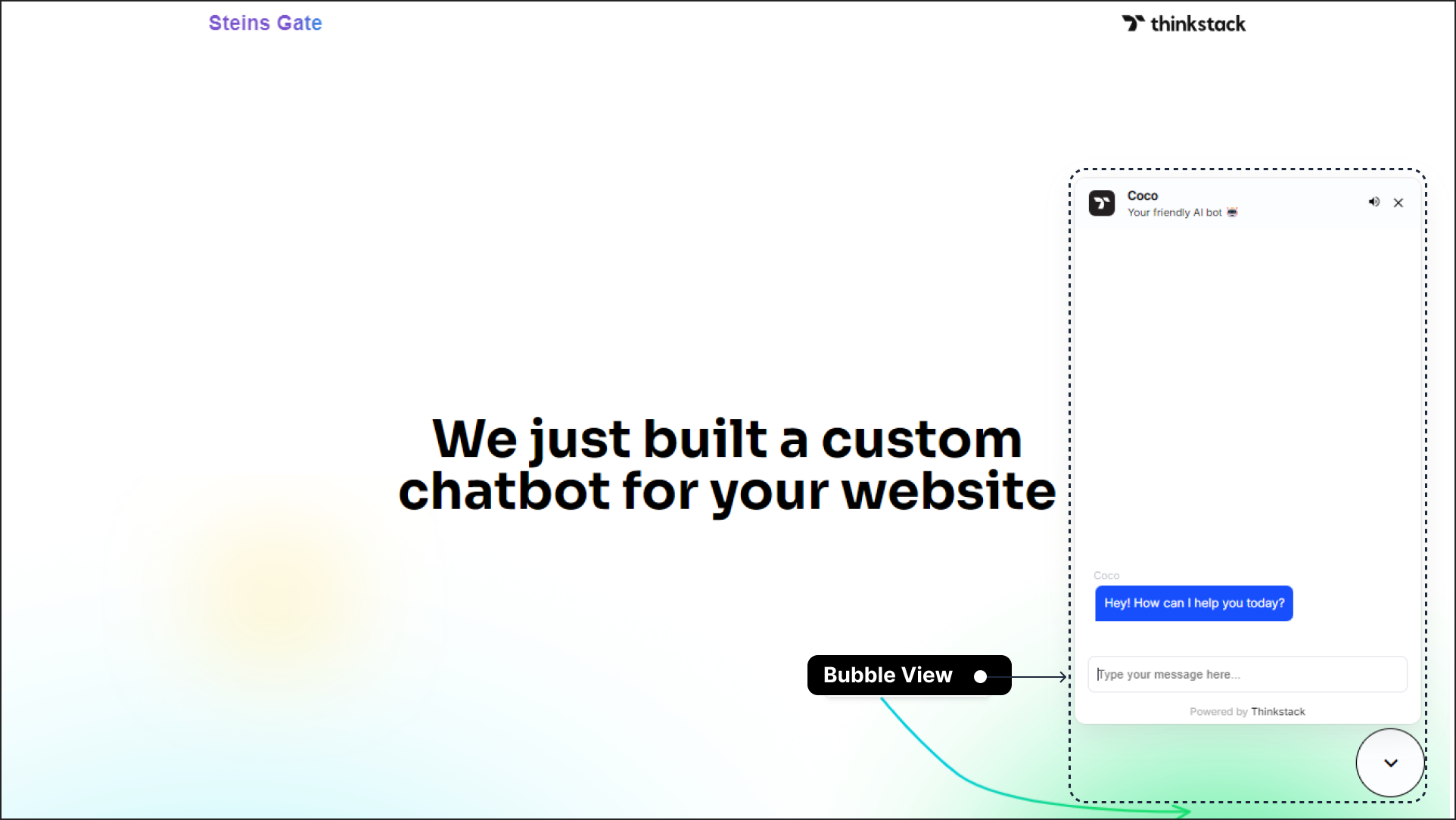
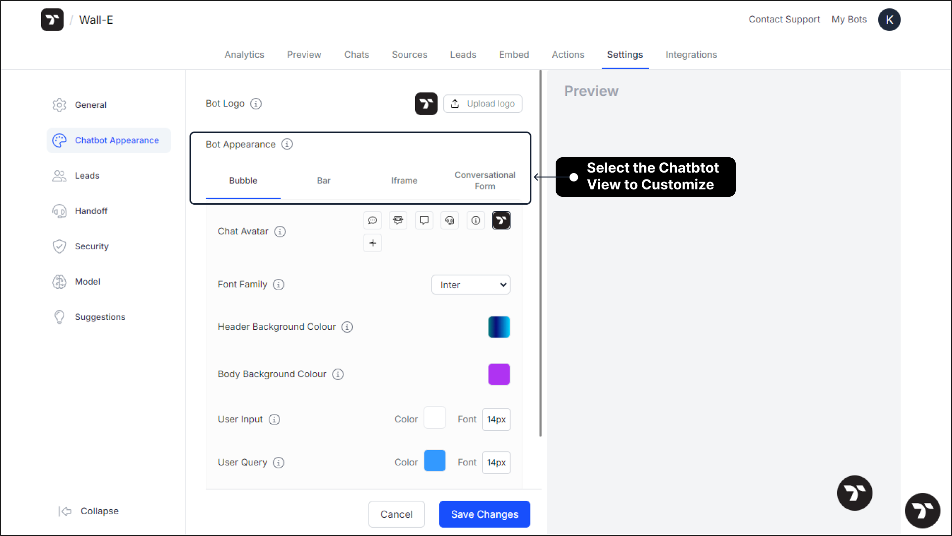
Bubble View: The chatbot appears as a clickable bubble icon positioned at the bottom-right corner of the website. When a user clicks the bubble, the chatbot interface opens, allowing the user to start interacting.
Bar View: The chatbot appears as a horizontal bar anchored at the bottom of the website. When a user clicks the bar, it expands into a chat interface, allowing the user to interact with the chatbot.
This is how the chatbot appears when you hover over the anchored bar: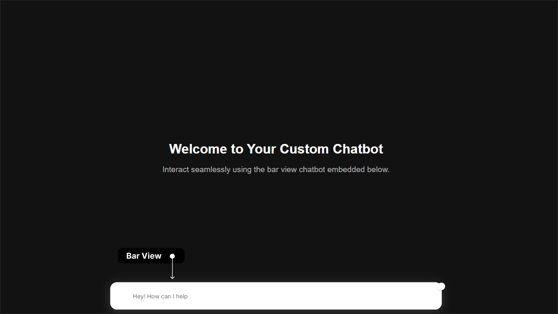
Iframe View: The chatbot can be embedded at any desired location on a website using an iframe. Users can click on the embedded iframe to start interacting with the AI chatbot.
Here's an example of how the chatbot appears when embedded using the iframe view: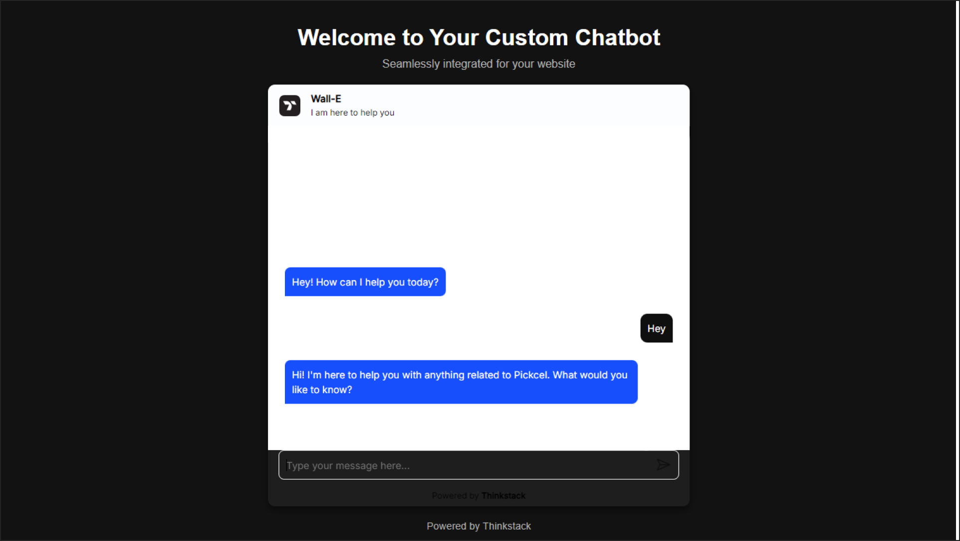
Conversational Forms: The chatbot is displayed as an interactive standalone conversational form, ideal for collecting user data in a structured and engaging way.
Here's a sample Conversational Form: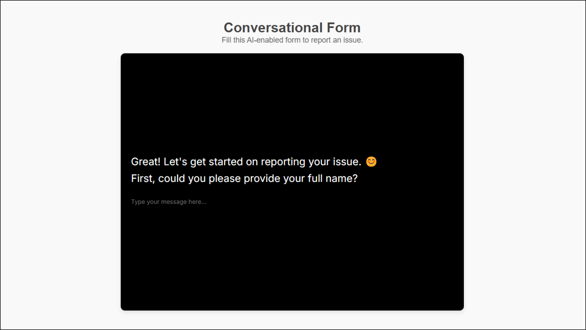
Now that you’re familiar with the various chatbot display options, let’s move on to customizing its appearance.
Modifying the Chatbot Appearance#
Navigate to the chatbot you wish to customize, click on it's 'Settings' in the top navigation bar, and select 'Chatbot Appearance' from the sidebar menu.
Chatbot Themes#
Choose a theme that best matches your design preference or brand identity. You can also create a custom theme by entering the hex code of your desired color.

note
To further personalize your chatbot, click the ‘Advanced Appearance Settings’ (+) button.
Add Chatbot logo#
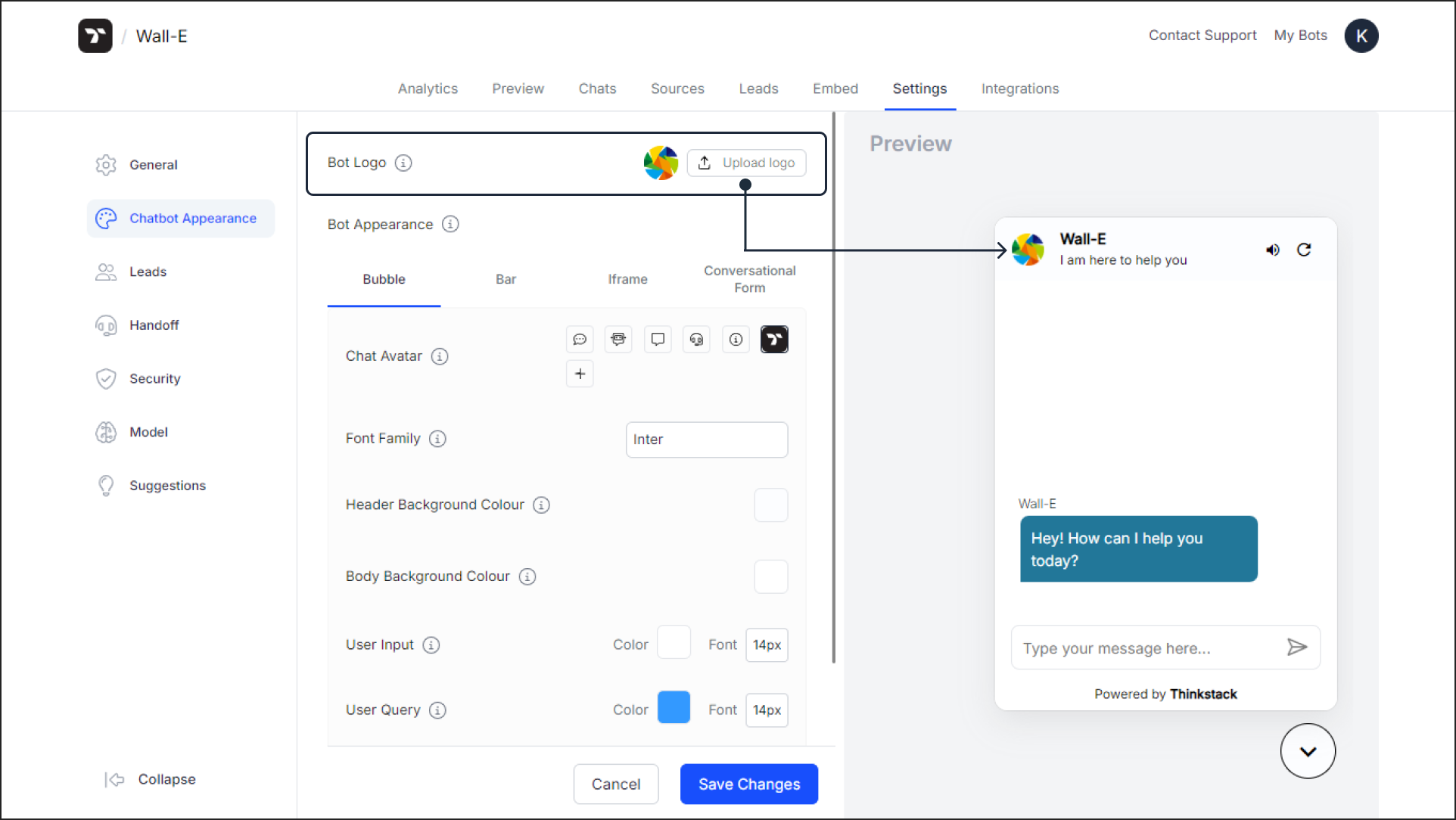
To start, let’s change the Bot Logo. By default, the chatbot displays the Thinkstack logo.
To replace it, click the "Upload Logo" button and upload a logo of your choice. Once uploaded, the logo will appear in the chatbot header, as shown in the image.
note
The bot logo should be in JPG or PNG format, sized at 32 x 32 pixels, and no larger than 300KB.
Now, choose a desired chatbot view to customize its respective appearance.
Chat Avatar#
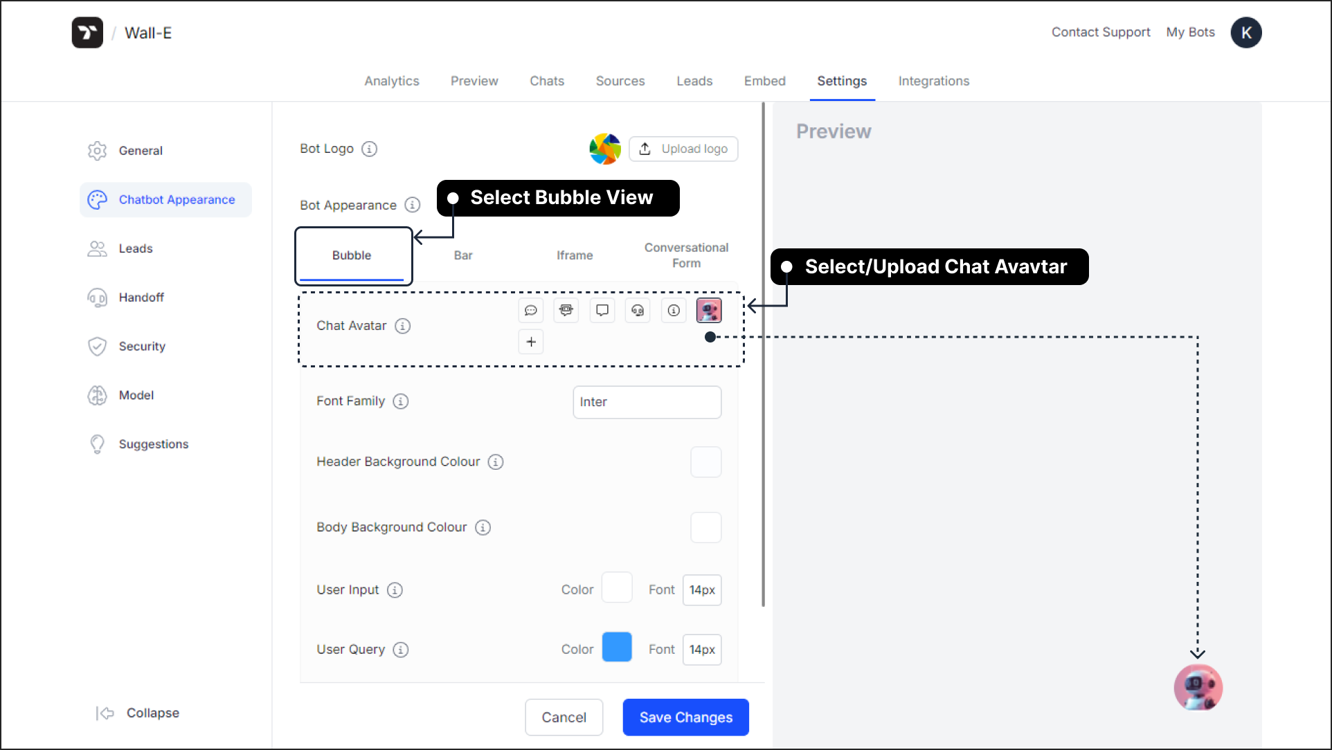
If Bubble View is your preferred choice, upload a chatbot avatar that represents your brand. This avatar will appear as a clickable circular icon at the bottom-right corner of the website, as shown in the image below.
note
Upload a chatbot avatar icon of your choice in JPG or PNG format, sized 32 x 32 pixels and no larger than 300KB, or select from the available sample avatar icons.
After selecting your preferred bot appearance, customize its style parameters to align the chatbot interface with your brand identity and design preferences.
Font#
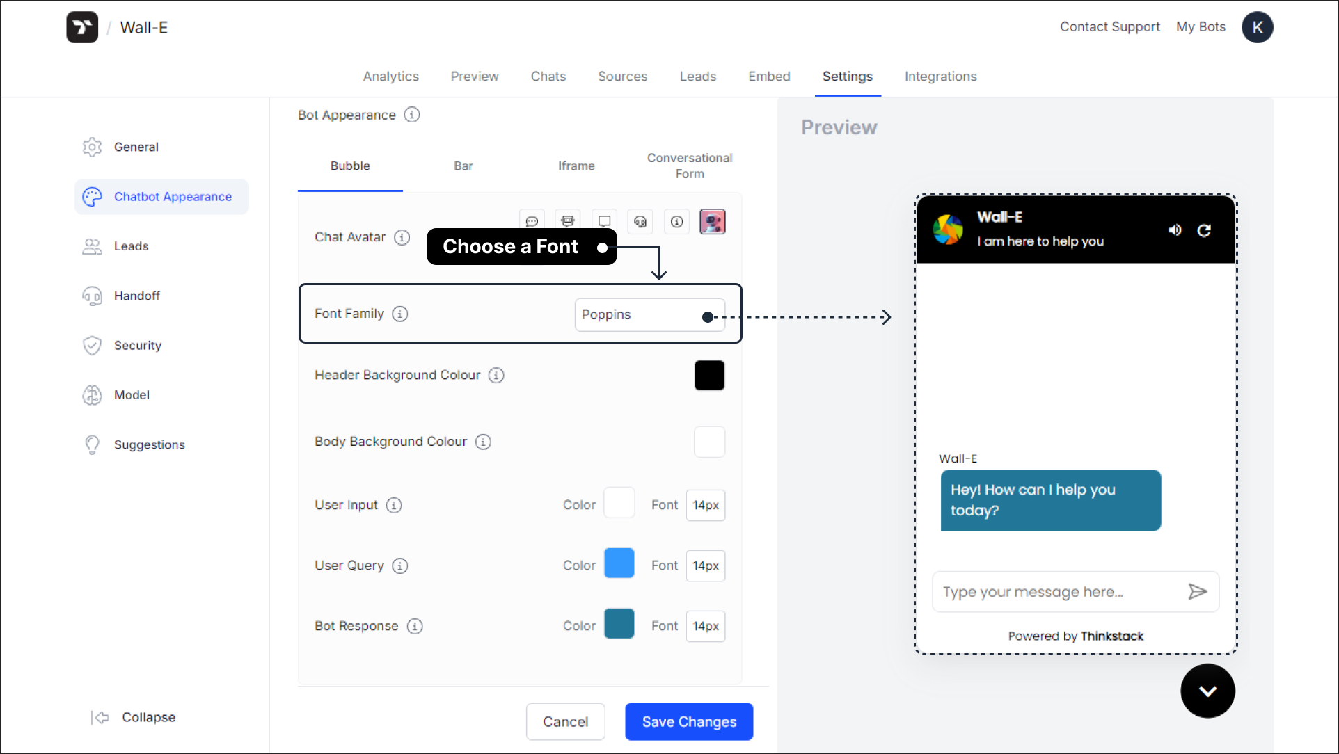
Select a font for your chatbot's text. This setting helps you display text that matches your website or brand’s style.
note
If the font you desire is not available in the dropdown, select Custom from the dropdown menu. Then, visit Google Fonts, find your preferred font, copy the font name from the URL slug, and paste it into the provided field.
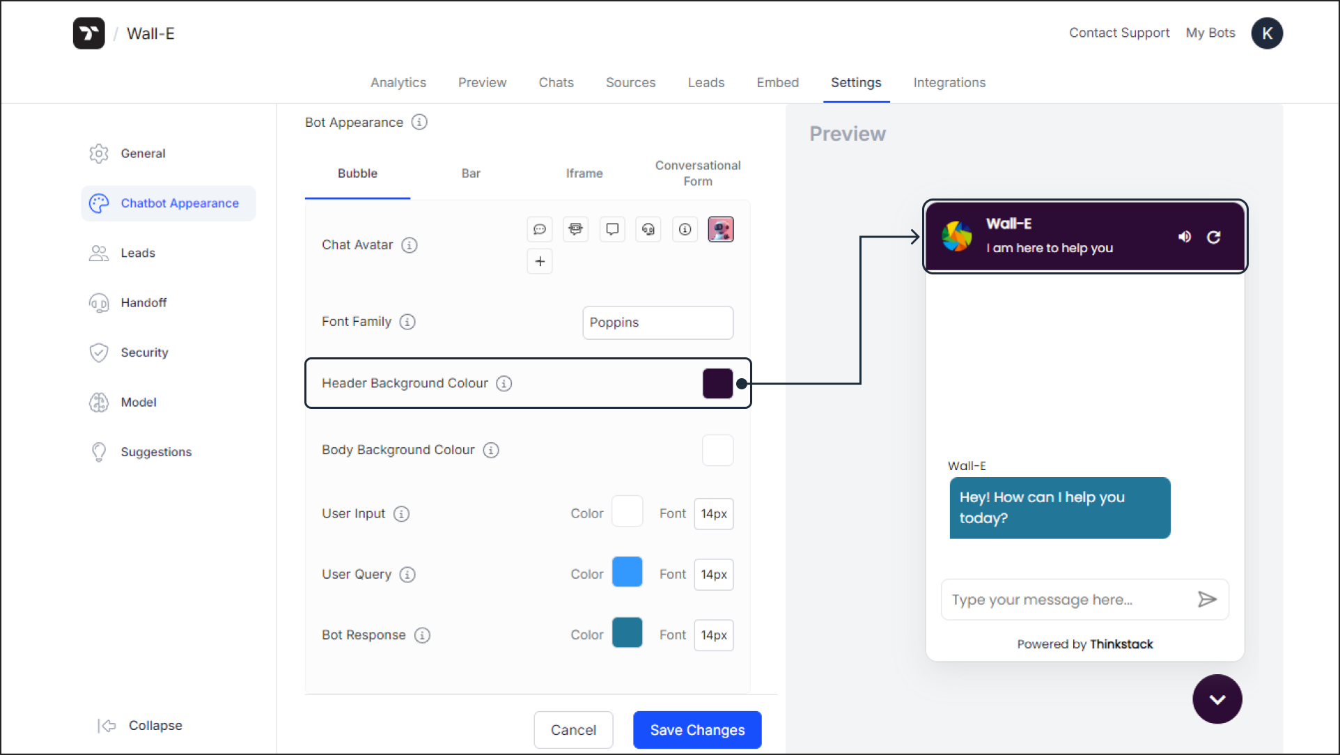
Header Background#
The header includes elements like the chatbot’s logo, name, and subheading. Choose the background color for the chatbot's header that aligns with your brand design principles.
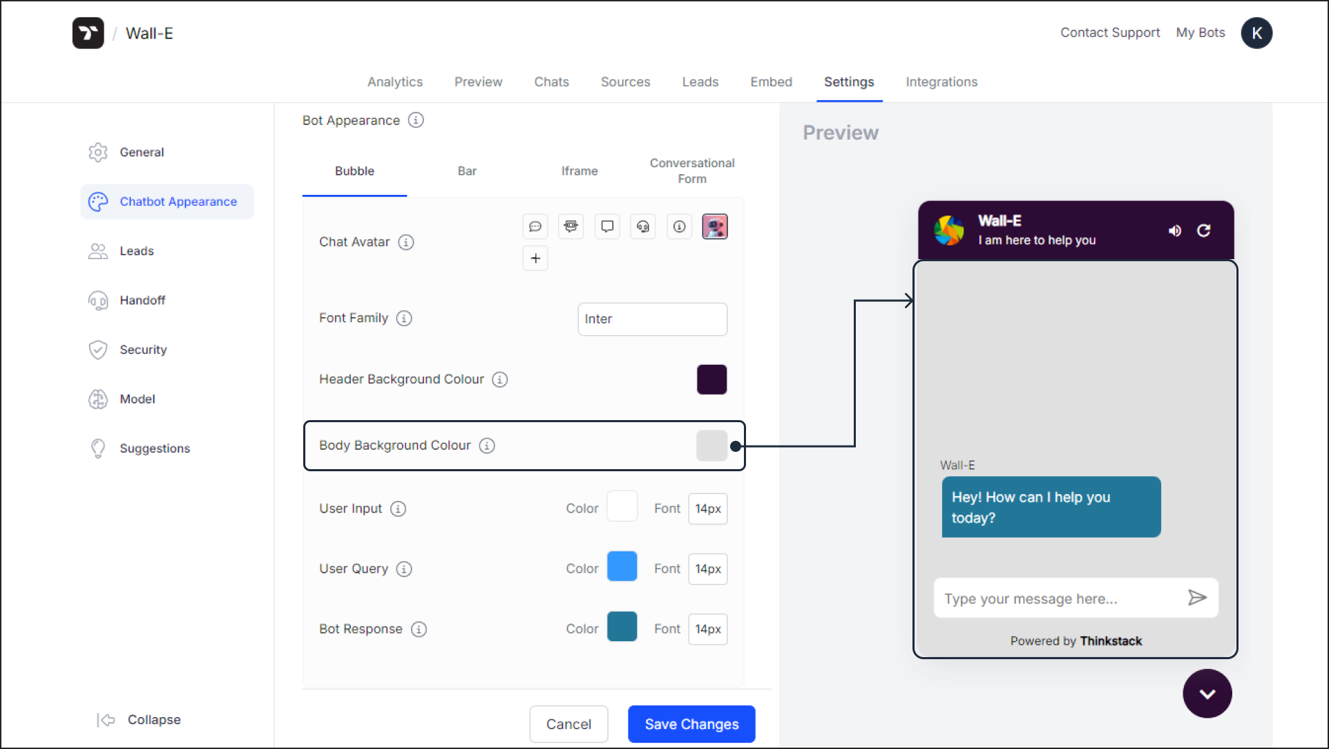
Body Background#
Customize the background color for the chatbot’s main chat area. This setting creates a visually appealing chat interface that complements your website’s design.
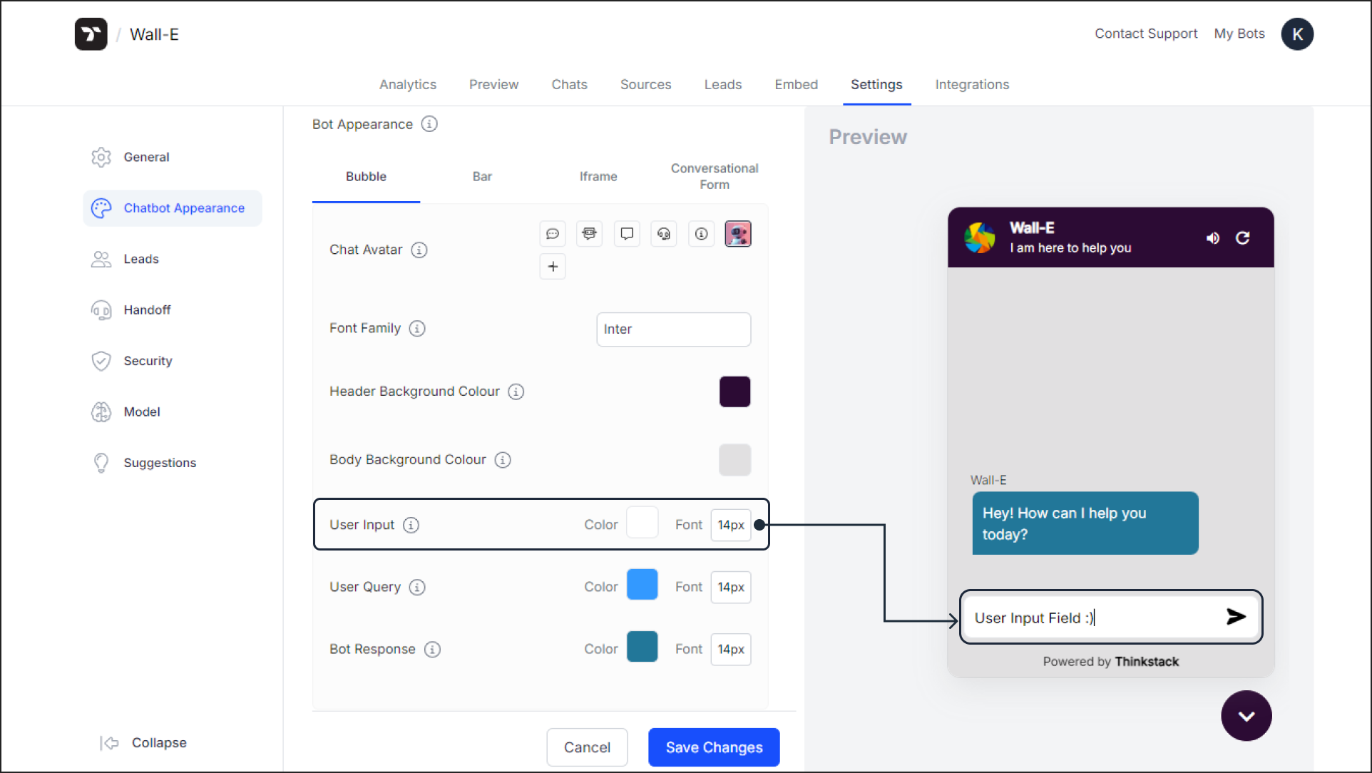
Input Background#
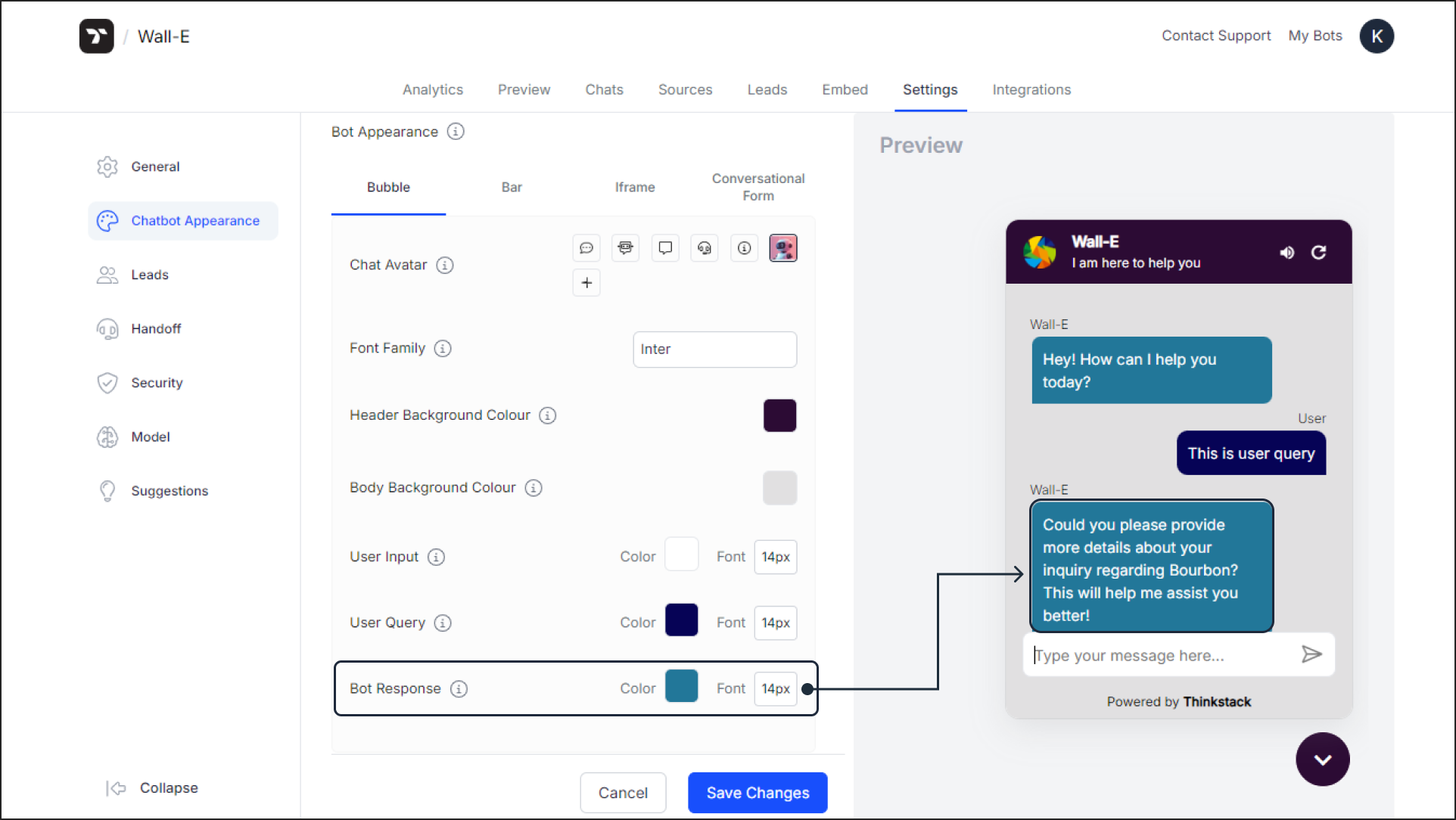
Set the background color of the user input field where users type their messages. Adjust the size of the text entered by the user for better readability.
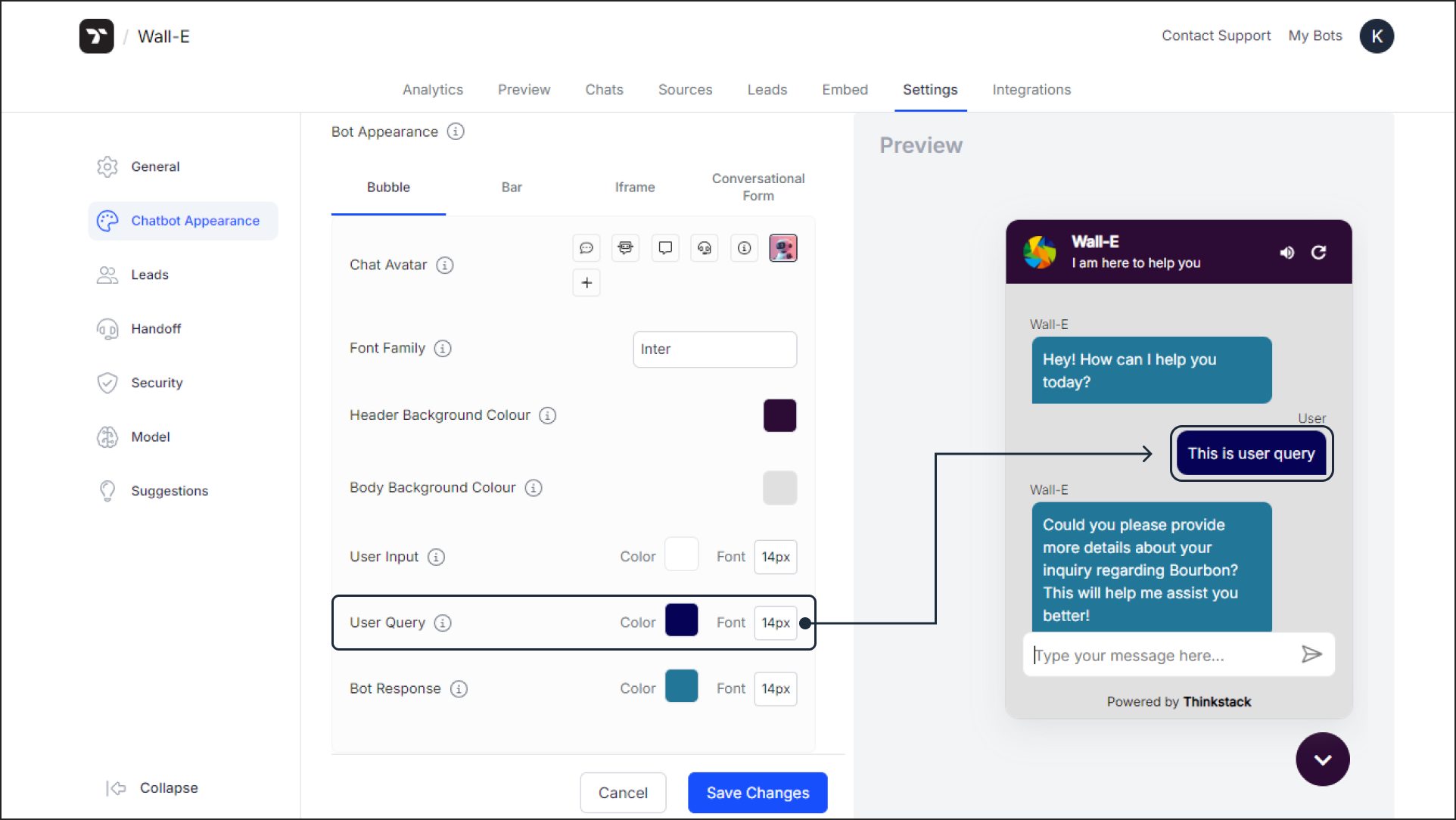
Query Background#
Set the background color for the queries or messages sent by the user. Customize the font size of user queries to ensure clarity and consistency.
Response Background#
Choose the background color for the chatbot’s responses. Adjust the font size of chatbot responses to ensure they are easy to read and visually aligned with the chat interface.
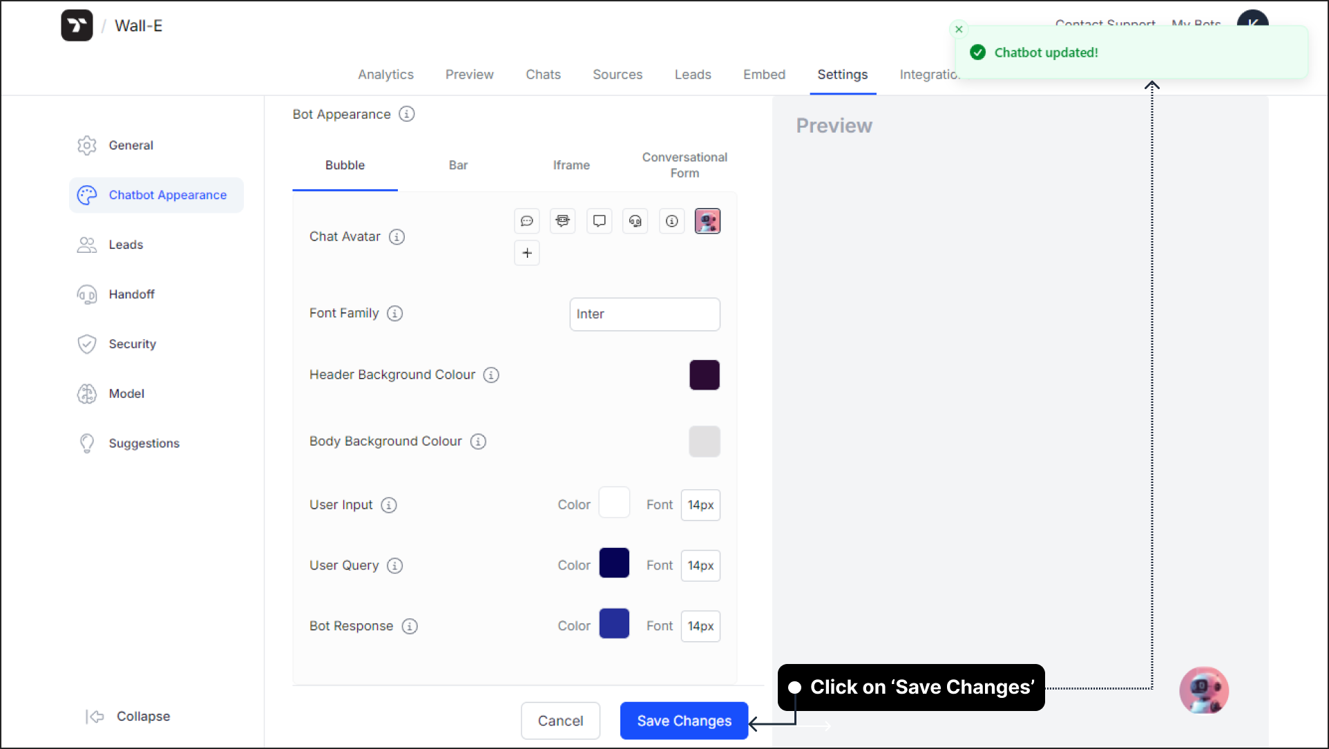
Once you've made your desired changes, click Confirm and Save to apply and save all the updates.
Preview Mode Display
If you edit the chatbot appearance for Bubble View and then switch to the Preview tab, your changes may not be visible. This is because the chatbot shown in the Preview tab is displayed in Iframe mode by default.
To see your appearance changes reflected in the Preview tab, you need to:
- Select Iframe View from the bot appearance options
- Apply your desired appearance settings to the Iframe View
- Click Confirm and Save
- Switch to the Preview tab to see your customizations
This ensures that your styling changes are applied to the correct view mode displayed in the preview.
warning
These changes apply exclusively to the chosen bot appearance view (in the above example: Bubble View). If you want to make changes to another chatbot view, simply select the desired bot appearance view, make the changes, and save it.
That's a wrap! 🎉 You have successfully customized your chatbot to match your brand identity and design preferences. Your chatbot is now ready to deliver a seamless and personalized experience to your users.